Turning heavy data and complex B2B SaaS into simple interfaces
An all-in-one data platform for a major US streaming service. Its hardest data problems, and the simple solutions I built for them, as Product Designer and Frontend Developer.
Context
A web-based data platform for campaign analytics. I joined once the product already existed, with a black-and-white theme in place. The contrast was so strong that focus scattered: everything competed for attention, and nothing guided the eye.
My main job was to soften the contrast and bring in color without redrawing the screens or breaking their style, and to reuse existing components so development stayed fast.
There was also a business ask. The product owner wanted the app to land with a wow effect and stay memorable. Demos happened in person, in front of managers and executives, and a salesperson sometimes had two to five minutes to both show and explain it. Memorable wasn't a nice-to-have. It was how the product got sold in the room.
My role
Product Designer and Frontend Developer. I owned the visual and interaction design and built it in the front end myself, in Angular with D3, THREE.js and Highcharts.
Doing both meant I designed against real constraints and shipped without a handoff gap: I reused existing components knowingly, knew what was cheap or expensive to build, and could adjust a design the moment the data or the code pushed back.
Challenge #1
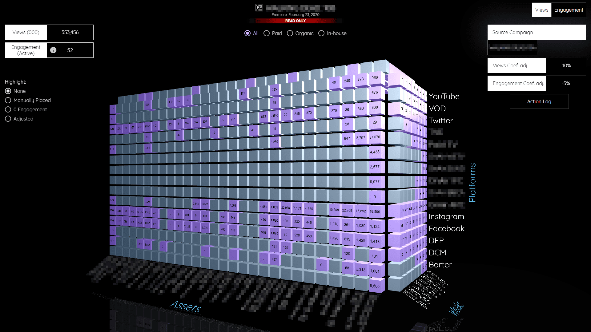
To make a call, analysts had to compare values across three dimensions at the same time: platform, asset, and week. In a flat table or chart they could only hold two at once, so every comparison meant switching views and keeping the third dimension in their head. Context kept slipping.
Solution
A 3D cube that holds all three axes at once (platforms, assets, and weeks), with the values sitting in the cells. Rotate it and the same numbers stay in place, so the third dimension is always visible instead of remembered. Filters and highlight modes (paid, organic, zero engagement, manually placed) let an analyst isolate what matters without leaving the view.
I used THREE.js to bring this idea to life.
Challenge #2
Configuring a chart normally means working in two places: change a setting in a panel, look back at the chart, adjust again. The back-and-forth is slow, and it is easy to lose your place. Here it was trickier: the values were linked, so raising one lowered another.
Solution
I merged the two into one element. Users edit the chart directly and see it update in real time, with no separate configuration step. Input and output share the same surface, so there is nothing to switch between.
I built it with D3.
Challenge #3
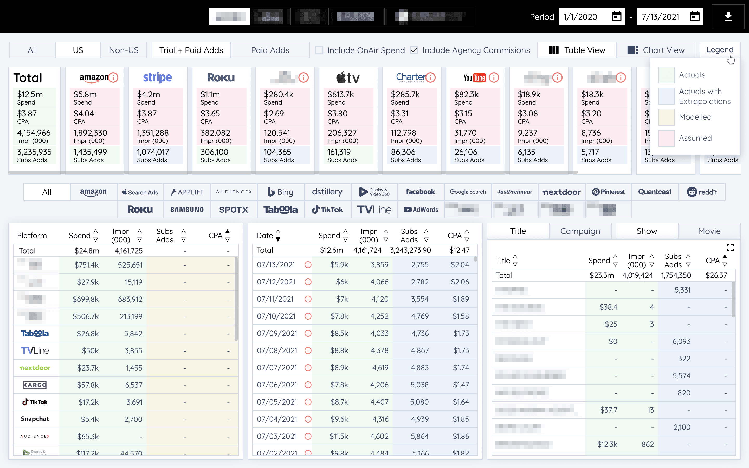
These dashboards carried more data than a screen can comfortably hold: spend, impressions, subscriber adds, and CPA across dozens of platforms, all at once. Cutting data wasn't an option. People needed all of it on one screen.
Solution
Compression without loss. Instead of hiding numbers, I reduced the space each one takes while keeping it readable. Color does some of the work a label would: whether a number is an actual, a model, or an assumption is carried by color, so the table stays dense without extra columns. The light theme was a deliberate call for a tool people sit with for hours. It keeps long sessions easier on the eyes.
On the technical side, I used lazy loading and reused components to keep load time to a minimum and to load only what the user actually wants to see.
The platform logos also act as filters, so each one needed an on and an off state. I converted them all to SVGs normalized to the same rectangle. One move solved three things: the logos sit in a clean, even grid even though they come in every shape and color; I can grey out the inactive ones with a single style change, so color reads as on and grey as off; and SVGs load fast.
Challenge #4
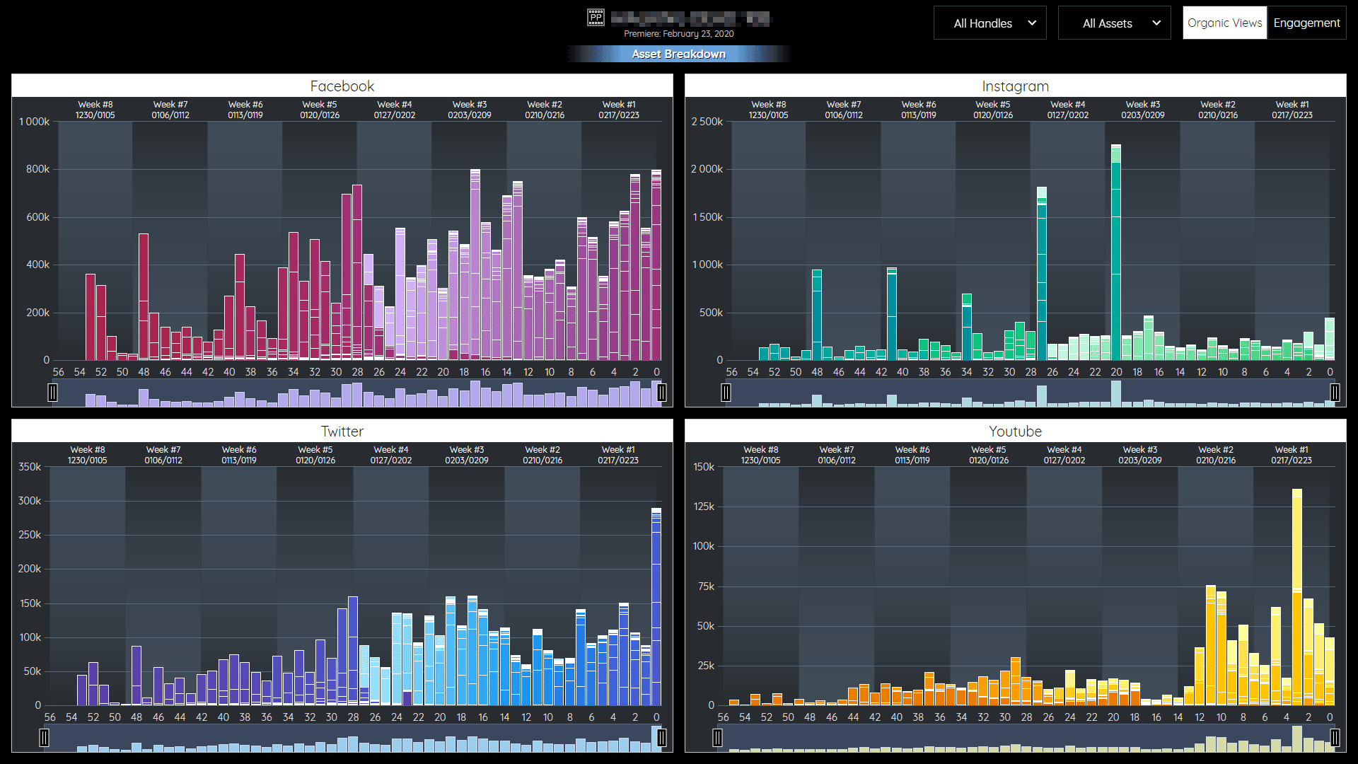
The charts ran across long time ranges, weeks and months of campaign data. Focusing on one stretch usually means calendar filters: open a date picker, set a start and end, apply, and redo it if the range is off. It is slow and disconnected from the chart you are actually reading.
Solution
Zoom on the chart itself. Drag across the timeline to select a period and the chart reframes to it. No date picker, no leaving the view. Same idea as the rest: keep the interaction on the chart, not in a panel beside it, like zooming into an image to see one part more clearly.
I built it using Highcharts, with some JavaScript on top to make the zoom behave the way I wanted.
All screens made from a real live application and censored to match NDA policy ✂
Outcome
None of these solutions were complicated on their own. The hard part was seeing, each time, what to remove instead of add. Being both designer and developer is what let me do that: I could try an idea in code the same day I sketched it and keep only the version that made the data easier to read. The result is a platform dense enough for analysts and clear enough to sell in a two-minute demo.